PROJECT - BUSINESS CARD
business card
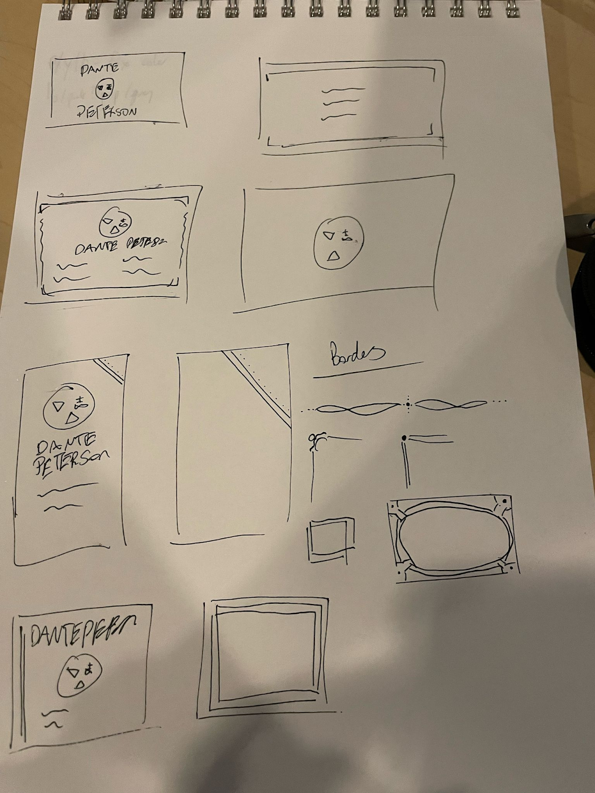
sketches

final cards
1)

2)


3)


artist statement
for my business cards, i made 3 varied designs for each different color version of my logo. i pulled resources for the purple and red damask patterns from vecteezy.com. i used fonts from adobe, and from dafont.com. for fonts on the first two cards- i used antiquarian scribe for my name, and bodoni 72 for my information. on the third design, i used im fell dw pica for all lettering. i used decorative signs 2 and cornpop for embellishments, and font type icons 2018 for the icons for my information. though i might go back and change the icons because they don't look as coherent as i would like.
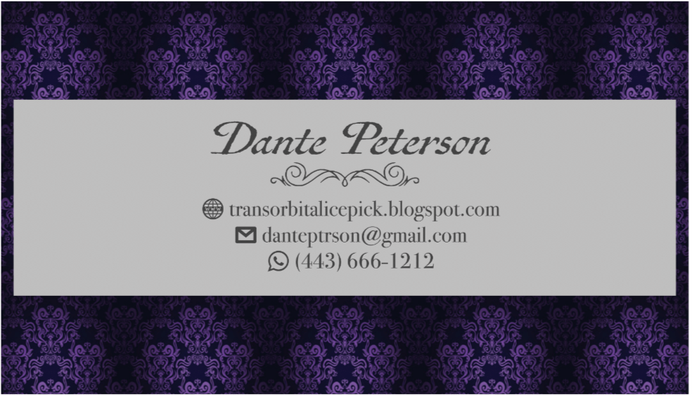
for my first design, i used the grey/purple/blue/pomegranate color palette of my logo. i used a purple repeatable pattern jpg to create the background- to make sure it was evenly made, i created a roughly .75 inch by .75 inch frame, placed the image, fitted the content proportionally, then fit frame to content. i centered it, then repeated it, and cropped where necessary. i then used a lighter shade of grey to make a place for my information / logo to be put on, so that it doesn't get lost in the background. i put my name and information on the front, with an embellishing swirl to add some depth.
for my second, i based it off my maroon brown / purple color palette. i struggled with deciding what i wanted the background color to be, and ended up color picking a brown from Vanitas Still Life with a Tulip, Skull and Hour-Glass by Philippe de Champaigne, which is a painting that uses the capuut mortuum pigment that i partially based my logo off of. i initially wanted to create a full border around the edges. however, i couldn't find a straight line embellishment i liked, so instead i just did the corners. i wanted to create an antiquated look, so i used a bevel on the corner borders and my name. i placed my logo on both sides of the card for this design.
for my final design, i used the black with red / yellow / blue coloring. i first went in and changed the yellow to a color that goes better with the red and blue, since it was drowned out by the saturation of the other colors. i wanted to base this design off the the Rider-Waite tarot deck, most notably The Fool, since i try to make that a motif in my personal styling / brand. for the background color, i used a color picked from The Fool's card, though not the background yellow so that the yellow of my logo would stand out appropriately. i put my name at the top of the card, then my logo, and then my information, separated by thin rectangles of the blue from my logo. for the back, i used a red damask pattern in the same was as the first card, to give the feel of a playing card.


I like your blog design first and foremost! Everything ties together very nicely in a sort of dystopic/tech feel. I also enjoy your business cards because they look so formal, but your logo still adds a layer of mystery. It draws the viewer in!
ReplyDelete