FINAL PROJECT - PORTFOLIO
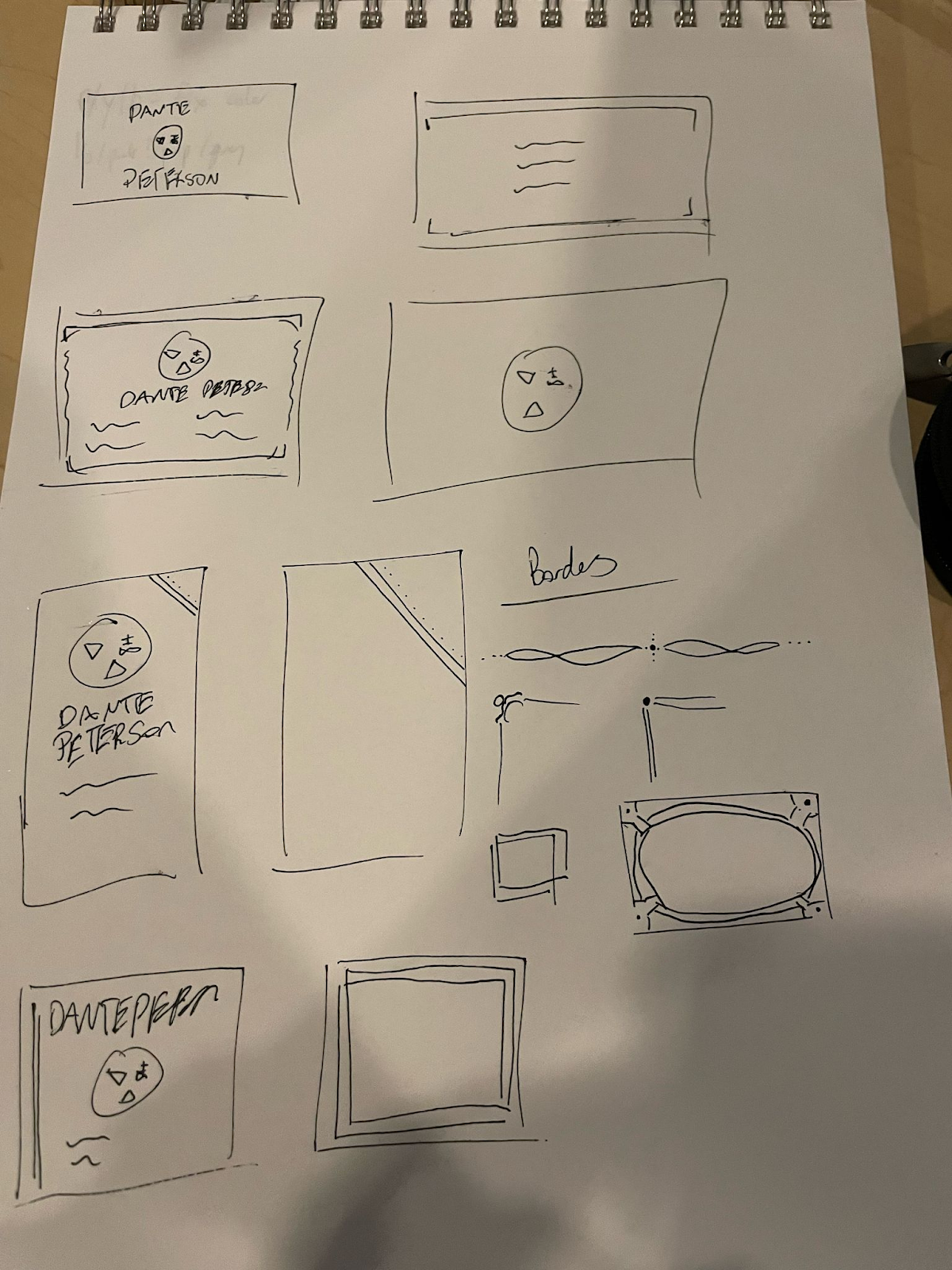
final portfolio sketches and inspiration final artist statement i pulled a lot of inspiration for my portfolio design off of a victorian era / vampiric vibe. i downloaded a template, but heavily altered it to my own design. i knew i wanted to go with a darker palette, and went through a lot of iterations until i decided on a custom palette. i chose a white and a black for the main background and text, because those stand out against each other well for easier visibility. i think that red and purple as accent colors are an unappreciated combo (as well as two of my favorite colors). i chose bats as my accent piece because i love bats- my eagle scout project was actually building bat boxes at a local camp. since i was pulling from victorian page design, i originally wanted to do a kind of border on the sides of the pages or in the corner. i decided that that was actually a decent amount of effort, i opted instead of bats at the bottom of the page telling you the page num...


